Learn Angular with free step by step angular tutorials
All you need to learn about Angular, the best tips and free code examples so you can get the most out of Angular.Angular Forms Best Practices
The art of building Forms
We all know the importance of providing a great user experience. User Experience (UX) is how a person feels when interacting with your application. UX is very important because it tries to fulfill the user's needs. It aims to provide a positive experience that keeps a user loyal to your product or brand.
In this post, we will discuss some points to consider when creating your application forms to ensure that you are providing a good user experience. Looking for code examples of angular forms and input validations?.
To design a good user experience, you need to know who you are designing for, who is going to use your app.
When building an app, there are some standard elements that are expected to be in place, functioning in a way that's intuitive to the user. You don't want to cause confusion to your users.
Forms can be the bottleneck of a conversion funnel, as they require the user to perform a task much more complicated than just a click, by thinking and typing all the required information asked by the form.
This may be much more frustrating in mobile devices with narrow screens, which is why, as app creators, we have to strive to do our best to provide a good UX, reducing user frustration and improving the funnel conversion.
From a design perspective, there are many UI libraries that provide a wide collection of nice form elements and form inputs that we can use to build our apps. Some of them are Angular Material, Bootstrap, Ionic. On the other hand, from a UX point of view, we can use Angular Form validations to improve the experience of our angular applications.
At first glance, forms can be very simple to learn. In no time you can create one with a couple of inputs and simple validations.
But when we look at the big picture, it's healthy to start asking questions like why are we building this form, what's the aim of this interaction, why do I need to ask this data to the user, when is the best time to ask for it, who are the users we need to design for, what are the browsers and devices and its varying sizes, and so on.
Taking into consideration all these questions, we need to ensure that the result is simple and accessible. So, from this perspective, designing a form can become a far more interesting and bigger challenge.
The following components are expected to be on a form:
- Labels: These tell users what the corresponding input fields mean.
- Input Fields: Input fields are where the user will enter the value that is asked. There are different types of files like text fields, password fields, number fields, date fields, check boxes, radio buttons, sliders and more.
- Actions: These are links or buttons that, when pressed by the user, perform an action, such as submitting the form.
- Help: Help blocks provide assistance on how to fill out the form correctly.
- Messages: They give feedback to the user based on their input. They can be positive (such as indicating that the form was submitted successfully) or negative ("The password is incorrect").
- Validations: The role of validations is to ensure that the data submitted by the user conforms to acceptable parameters. For example a valid phone number.
Form structure and layout
Alignment
Using a correct alignment is a very simple trick which helps in providing structure to the content. It is nothing but arranging text in the most efficient way- allowing for efficient, effective scanning and limiting errors or missed fields.
Basically, having the label text as close to the input field makes the grouping more relatable. It is easier to associate them due to their proximity.
Angular Material, and almost every framework, provides different position options to organize the labels and inputs in a very easy way.
Grouping related fields
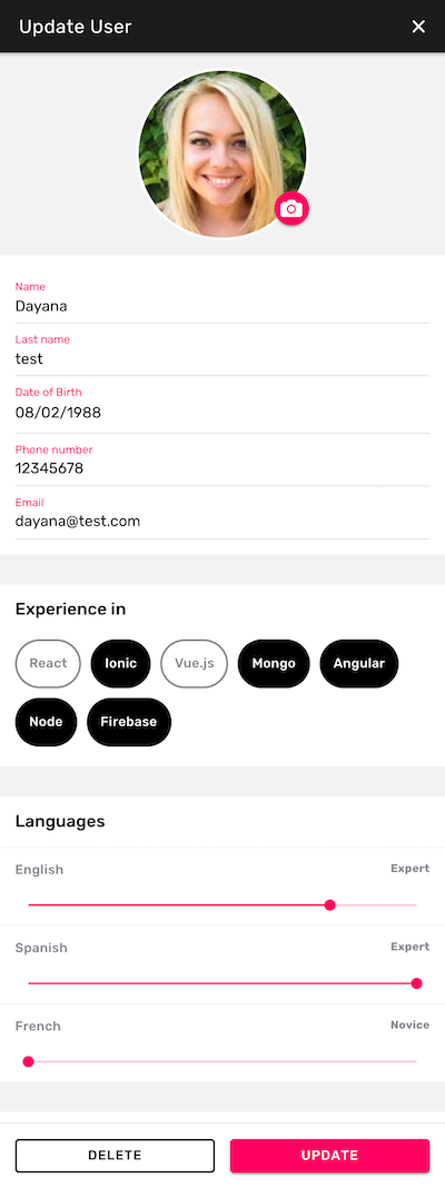
Arranging inputs into sections is an easy way to highlight association and to de-clutter the layout. It's a good practice to give each section its respective header and breathing space (padding).
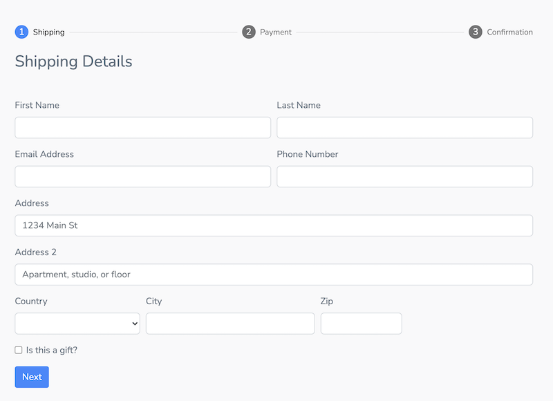
Also, for really long forms it is a good practice to use a stepper or wizard component. This is very common in checkout forms.
Let's see some examples:
The following is the stepper from Fully Angular Admin Template. It is built using Angular Material.
The next screenshots is part of Ionic 5 Full Starter App. This example uses Ionic framework to create a Profile page with different form input types. You can see that the inputs are grouped by sections.
Input type
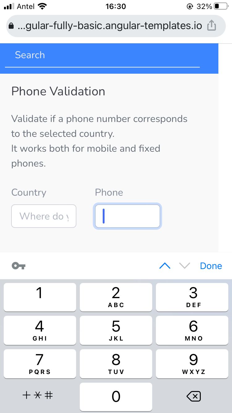
It's not a good practice to make the user or the browser guess the input type. By explicitly defining the input type you can help the browser or device provide a better UX. For example, if the type is "number", the device should open directly the numeric keyboard. So, providing the correct keyboard type is crucial, especially for mobile apps.
Let's see some examples of Fully Angular Admin Template opened from a mobile device.
Phone input type
Numeric input type
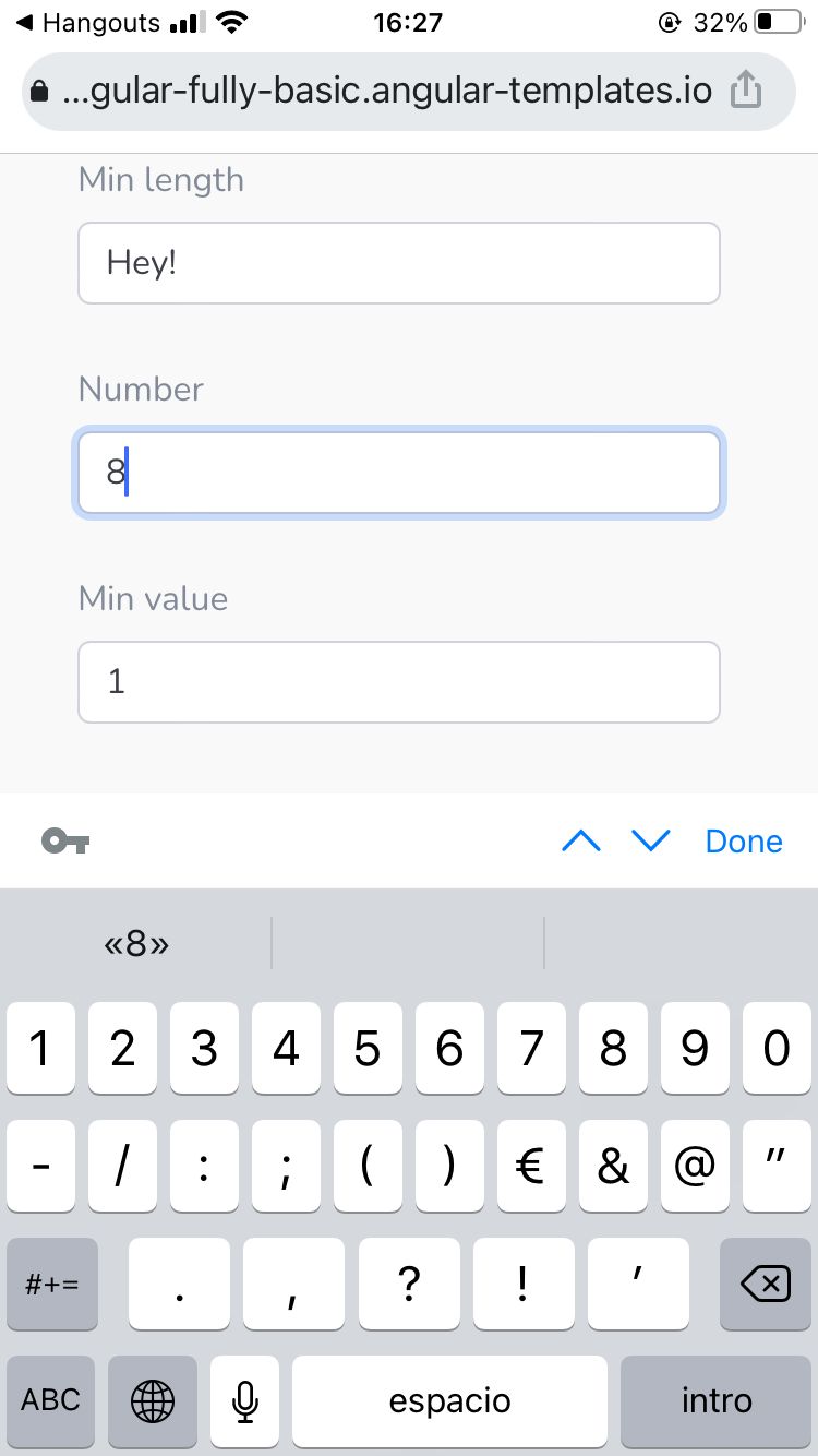
Also, for some fields such as username and password, you can use the autocomplete option. This will improve the user experience because you will offer the user the possibility to preload the input for them. Inputs have a property autocomplete that you can use to indicate whether the value of the control can be automatically completed by the browser.
Hints or help blocks
Users are lazy, so we need to help them as much as possible when filling out a form. Giving a few suggestions in advance can be a good way to get their thoughts running. Also, adding some visual cues can be even better.
For example, you can add help messages that provide assistance to the user on how to fill an input correctly.


Validations
Generally speaking, there are three important messages that a good form validation should convey to the user:
- An error has occurred. Display clearly that there is an error in the form, preferably using a red color signal to attract attention.
- Where the error occurred: Highlighting the fields that caused the error.
- How the error can be repaired: Provide information on what needs to be different in order for the field to validate.
All these have one clear goal: to avoid confusion. To minimise drop-outs, make sure to create validation that eliminates any risk of customers being confused.
Let's see some examples.
Username validation
Username must contain at least 5 characters and only letters and numbers.
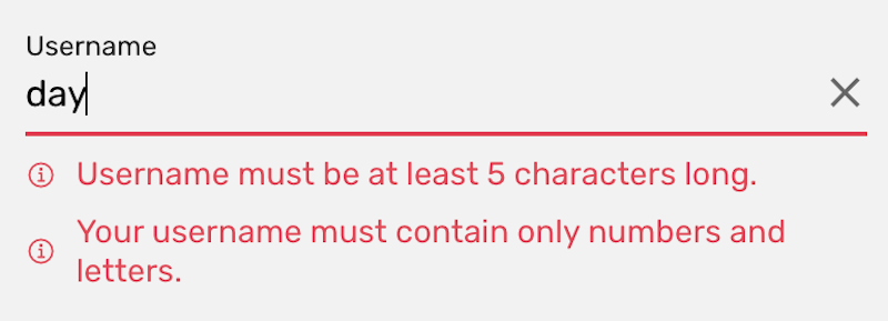
Password matching validation
Password must contain at least 5 characters and at least one uppercase, one lowercase, and one number. Also password should match the confirmation password input.
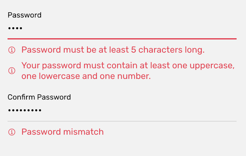
Form validation with error messages
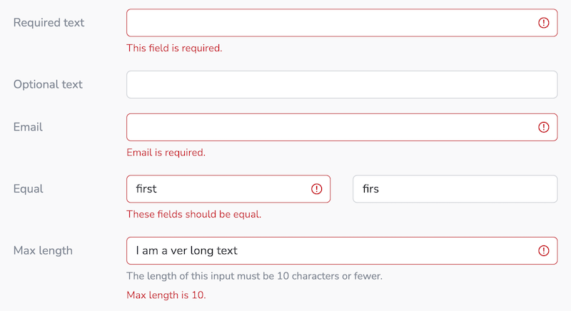
Form error and success messages
Different ways of styling a form with error and success messages.
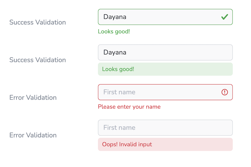
This article is just about forms UX, however, if you want to learn how to create this form validations in angular, you should check this Angular Forms and Validations example complete tutorial.
Also, in Fully - Angular Admin Template you can find lots of input validations examples, both basic and advanced.
Timing — When should we perform the form validation?
The key is to avoid interrupting and disturbing the user. Also, it is not recommended to do all the validations at the end, when the user submits the form. Imagine that scenario, the user spent some time completing each entry (without knowing the limitations beforehand) and finally when he thinks the task is finished, the app shows him multiple error messages caused by invalid entries. Frustrating!
A better alternative may be to consider these options:
- Real time: It means validating as you type. These are super handy and are the default for Angular Validators.
- On blur: It can be less disturbing for certain cases as we only validate when the user is focused outside of the form input. However, the user will only see the errors once they move on to the next entry.
- Disable submit button until the form is valid.
Accessibility
It's a common misconception to think that accessibility is an optional feature in mobile app development. Both iOS and Android provide accessibility tools to help developers create an accessible UX for all users, including those with a disability or impairment. Despite the tools being provided by the platform, the overall accessibility of any project depends in large part on the author's markup, additional styling, and scripting they've included.
It's important to mention that not only disabled people benefit from good accessibility. Nowadays, voice assistants like Siri and Alexa are becoming ubiquitous, and haptic feedback (e.g. vibrations) are a part of Google's Material Design guidelines. For example, some users might want to navigate an app while driving a car or cooking lunch, without having to touch the device.
Forms are constantly used to collect information from users, so it is imperative to make forms accessible to ALL users. This means building our forms with best accessibility practices in mind.
This guide mentions some good practices about Forms, Form Validation, and CAPTCHAs.
Also, make sure to check this guide on form concepts to create websites that meet WCAG.
What else do you take into consideration when building forms?
Check our
YouTube Channel

TOPICS
TABLE OF CONTENTS
-
Introduction
-
Form structure and layout
-
Hints or help blocks
-
Input type
-
Validations
-
Accessibility
Comments
Our aim is to help developers of different skill levels get the most out of Angular by saving their expensive time and providing great resources for them to learn faster and better.
